Nova Bank
Neobank App
“I spent 14 years in banking and watched every major bank ship the same app with a different logo. None of them were built for how people actually manage money today. I wanted a neobank experience that felt native to this generation. Norde designed the whole thing and built the front end, and our beta testers thought it came from a company many times our size.”
Marcus
Founder & CEO, Nova Bank
Marcus had spent over a decade inside traditional banking. He understood the infrastructure, the compliance requirements, and the regulatory landscape. What he could not understand was why every digital banking app felt like a legacy system with a fresh coat of paint. Balance screens that took 3 taps to reach. Card management buried in settings menus. Budget tools that required a finance degree to configure. He left his role to build what he believed retail banking should feel like.
The strategy phase was critical. Fintech products carry more complexity than most MVPs. We mapped out the core experience across 4 pillars: a dashboard that surfaces balances, cards, and budgets in a single scroll. A card management system with instant freeze, spending limits, and real-time transaction feeds. A payments hub for peer-to-peer transfers and recurring bill management. And a budget tracker that works automatically against daily and monthly spending patterns. Every screen had to feel fast, premium, and trustworthy. In banking, design is trust.
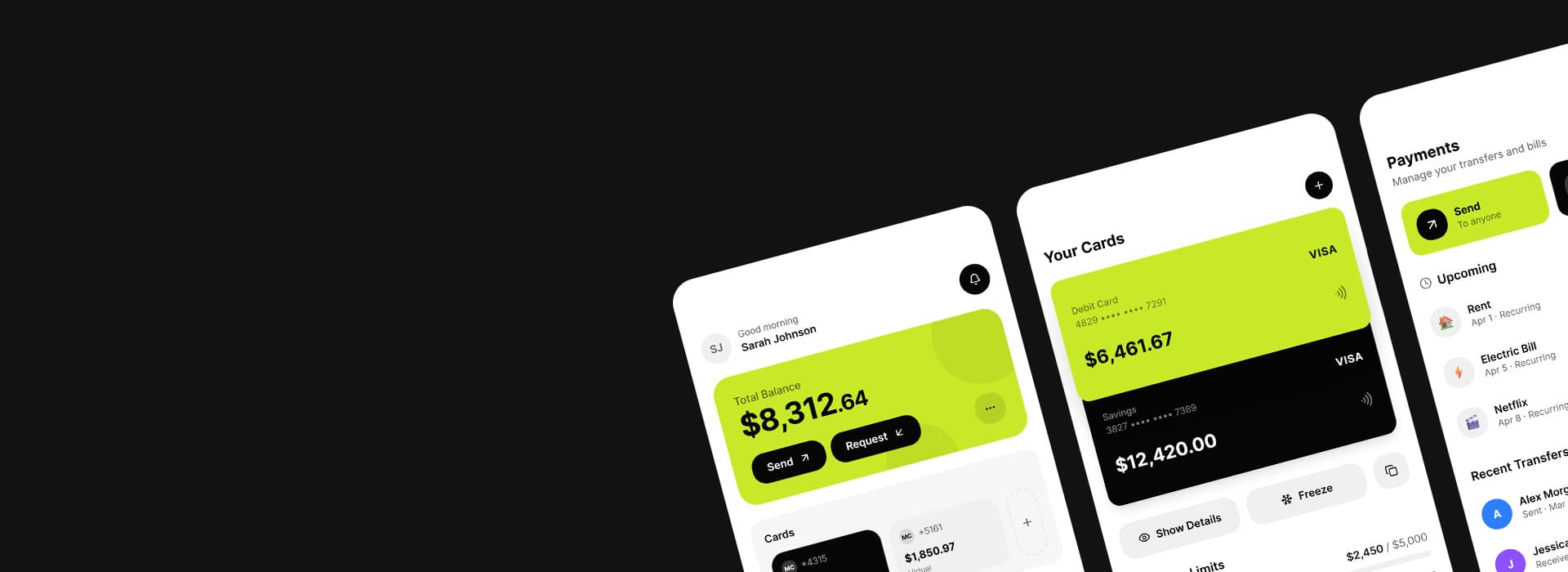
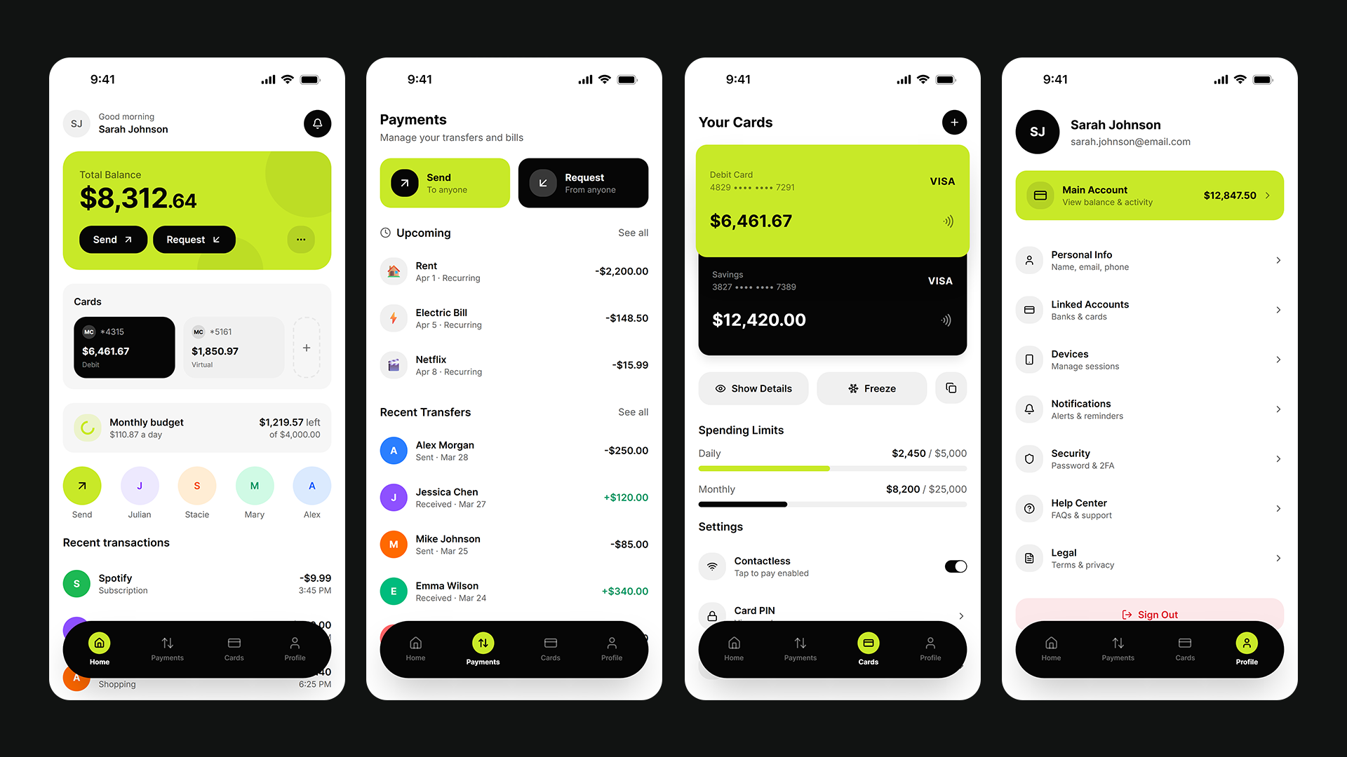
We designed Nova Bank and built the front end in 30 days. A personalized home screen showing total balance across all accounts, linked cards with individual balances, and a daily budget tracker. A card detail view with one-tap freeze, spending limit controls, and transaction categorization. A payments screen with instant send and request, contact shortcuts, and upcoming bill reminders. The visual language was deliberate: black and chartreuse, rounded cards, bold typography, a product people would want to show their friends. We owned the design and the front-end build; Marcus's team handled the banking backend behind it.
Marcus's team took the front end into their backend and launched. He had grown a waitlist of 3,200 people through a landing page and targeted LinkedIn content, and the feedback was immediate and specific: users said it was the first banking app where they actually understood their money at a glance. The design did not feel like a prototype. It felt like a product people had been waiting for.
Client names changed under NDA. Results and deliverables are real.
Project snapshot
Want results like this?
Book a free 30-minute call. We'll tell you honestly if we can build it, and what it would take.